Plot on curvelinear grid#
Preface#
If you are working with radar station data, it is almost ever only available as polar data. This means you have a 2D-array, one dimension holding the azimuth (PPI) or elevation (RHI) angle values and the other holding the range values.
In \(\omega radlib\) it is assumed that the first dimension is over the azimuth/elevation angles, while the second dimension is over the range bins.
Create Curvelinear Grid#
The creation process of the curvelinear grid is bundled in the helper function wradlib.vis.create_cg(). I will not dwell too much on that, just this far wradlib.vis.create_cg() uses a derived Axes implementation.
wradlib.vis.create_cg() takes scan type (‘PPI’ or ‘RHI’) as argument, figure object and grid definition are optional. The grid creation process generates three axes objects and set some reasonable starting values for labeling.
The returned objects are cgax, caax and paax.
cgax: matplotlib toolkit axisartist Axes object, Curvelinear Axes which holds the angle-range-gridcaax: matplotlib Axes object (twin to cgax), Cartesian Axes (x-y-grid) for plotting cartesian datapaax: matplotlib Axes object (parasite to cgax), The parasite axes object for plotting polar data
A typical invocation of wradlib.vis.create_cg() for a PPI is:
# create curvelinear axes
cgax, caax, paax = create_cg('PPI', fig, subplot)
For plotting actual polar a single functions exist wradlib.vis.plot().
Note
Other than most plotting functions you cannot give an axes object as an argument. All necessary axes objects are created on the fly. You may give an figure object and/or an subplot specification as parameter. For further information on howto plot multiple cg plots in one figure, have a look at the special section Plotting on Grids.
When using the
refrackeyword with wradlib.vis.plot() the data is plotted to the cartesian axiscaax.
Seealso
If you want to learn more about the matplotlib features used with wradlib.vis.create_cg(), have a look into
Plotting on Curvelinear Grids#
Plot CG PPI#
wradlib.vis.plot() with keyword cg=True is used in this section.
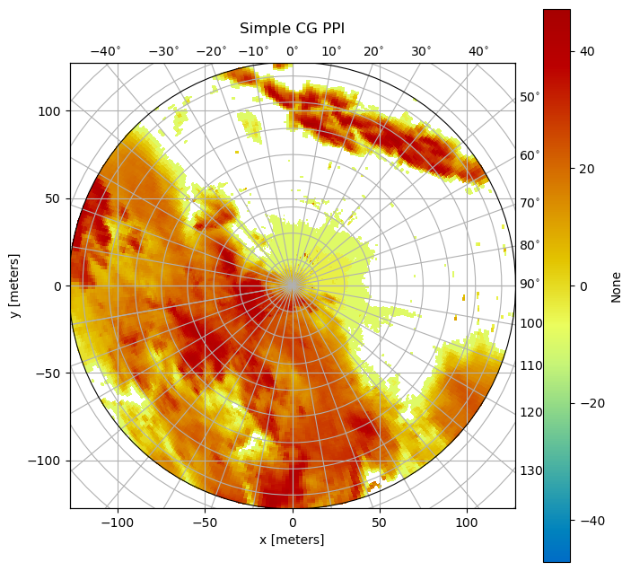
Simple CG PPI#
First we will look into plotting a PPI. We start with importing the necessary modules:
[1]:
import wradlib as wrl
import xarray as xr
import matplotlib.pyplot as plt
import warnings

warnings.filterwarnings("ignore")
try:
    get_ipython().run_line_magic("matplotlib inline")
except:
    plt.ion()
import numpy as np
/home/runner/micromamba/envs/wradlib-tests/lib/python3.11/site-packages/h5py/__init__.py:36: UserWarning: h5py is running against HDF5 1.14.3 when it was built against 1.14.2, this may cause problems
  _warn(("h5py is running against HDF5 {0} when it was built against {1}, "
Next, we will load a polar scan from the WRADLIB_DATA folder and prepare it:
[2]:
# load a polar scan
filename = wrl.util.get_wradlib_data_file("misc/polar_dBZ_tur.gz")
data = np.loadtxt(filename)

# create range and azimuth arrays accordingly
r = np.arange(0, data.shape[1], dtype=float)
r += (r[1] - r[0]) / 2.0
r *= 1000.0
az = np.arange(0, data.shape[0], dtype=float)
az += (az[1] - az[0]) / 2.0

# mask data array for better presentation
mask_ind = np.where(data <= np.nanmin(data))
data[mask_ind] = np.nan
ma = np.ma.array(data, mask=np.isnan(data))

da = wrl.georef.create_xarray_dataarray(
    data, r=r, rf=1000.0, phi=az
).wrl.georef.georeference()
Downloading file 'misc/polar_dBZ_tur.gz' from 'https://github.com/wradlib/wradlib-data/raw/pooch/data/misc/polar_dBZ_tur.gz' to '/home/runner/work/wradlib/wradlib/wradlib-data'.
[3]:
display(da)
<xarray.DataArray (azimuth: 360, range: 128)>
array([[ 7.01,  8.28,  5.46, ...,   nan,   nan,   nan],
       [ 7.01,  7.01,  7.01, ...,   nan,   nan,   nan],
       [ 7.01,  7.67,  5.46, ...,   nan,   nan,   nan],
       ...,
       [ 7.01,  8.28,  5.46, ..., 14.87, 17.76, 15.51],
       [ 7.67,  7.67,  5.46, ...,  0.64,  8.83,  4.53],
       [ 8.83,  7.67,  4.53, ..., -8.99, -4.17, -8.99]])
Coordinates: (12/14)
  * range       (range) float64 0.5 1.5 2.5 3.5 4.5 ... 124.5 125.5 126.5 127.5
  * azimuth     (azimuth) float64 0.5 1.5 2.5 3.5 ... 356.5 357.5 358.5 359.5
    elevation   (azimuth) float64 0.0 0.0 0.0 0.0 0.0 ... 0.0 0.0 0.0 0.0 0.0
    longitude   float64 0.0
    latitude    float64 0.0
    altitude    float64 0.0
    ...          ...
    y           (azimuth, range) float64 0.5 1.5 2.5 3.5 ... 125.5 126.5 127.5
    z           (azimuth, range) float64 1.49e-08 1.322e-07 ... 0.0009558
    gr          (azimuth, range) float64 0.5 1.5 2.5 3.5 ... 125.5 126.5 127.5
    rays        (azimuth, range) float64 0.5 0.5 0.5 0.5 ... 359.5 359.5 359.5
    bins        (azimuth, range) float64 0.5 1.5 2.5 3.5 ... 125.5 126.5 127.5
crs_wkt int64 0For this simple example, we do not need the returned axes. The plotting routine would be invoked like this:
[4]:
fig = plt.figure(figsize=(8, 8))
pm = da.wrl.vis.plot(fig=fig, crs="cg")
ax = plt.gca()
t = plt.title("Simple CG PPI", y=1.05)
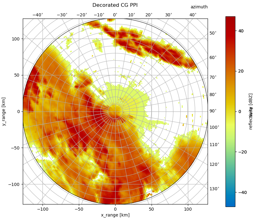
Decorated CG PPI#
Now we will make use of some of the capabilities of this curvelinear axes.
You see, that for labeling x- and y-axis the cartesian axis is used. The azimuth label is set via :func:text. Also a colorbar is easily added. The plotting routine would be invoked like this, adding range and azimuth arrays:
[5]:
fig = plt.figure(figsize=(10, 8))
pm = da.wrl.vis.plot(fig=fig, crs="cg")
cgax = plt.gca()
caax = cgax.parasites[0]
paax = cgax.parasites[1]

plt.title("Decorated CG PPI", y=1.05)
cbar = plt.colorbar(pm, pad=0.075, fraction=0.046, ax=paax)
caax.set_xlabel("x_range [km]")
caax.set_ylabel("y_range [km]")
plt.text(1.0, 1.05, "azimuth", transform=caax.transAxes, va="bottom", ha="right")
cbar.set_label("reflectivity [dBZ]")
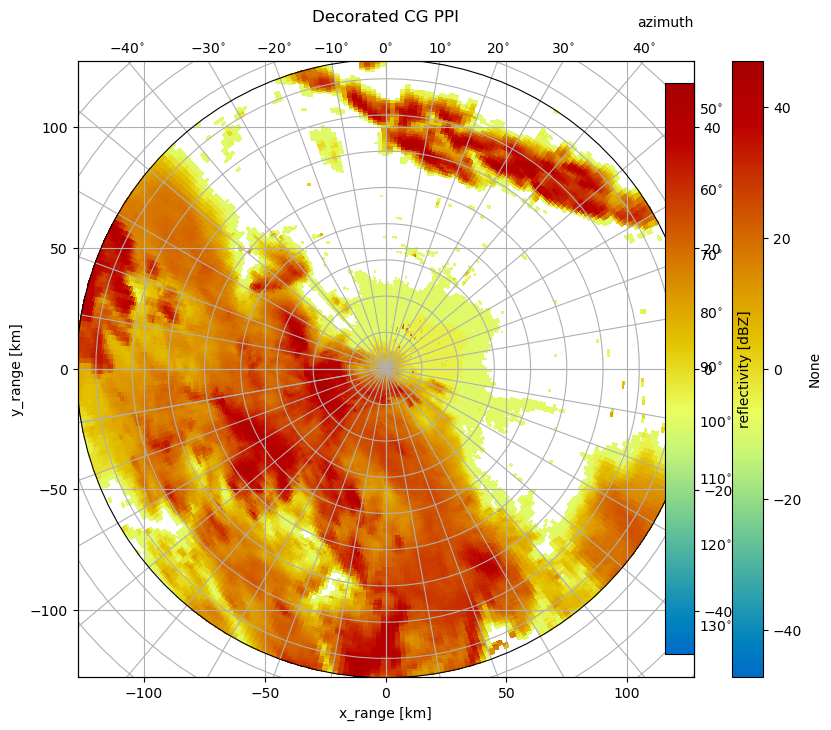
And, we will use cg keyword to set the starting value for the curvelinear grid. This is because data at the center of the image is obscured by the gridlines. We also adapt the radial_spacing to better align the two grids.
[6]:
cg = {"radial_spacing": 14.0, "latmin": 10}
fig = plt.figure(figsize=(10, 8))
pm = da.wrl.vis.plot(fig=fig, crs=cg)
cgax = plt.gca()
caax = cgax.parasites[0]
paax = cgax.parasites[1]

t = plt.title("Decorated CG PPI", y=1.05)
cbar = plt.gcf().colorbar(pm, pad=0.075, ax=cgax)
caax.set_xlabel("x_range [km]")
caax.set_ylabel("y_range [km]")
plt.text(1.0, 1.05, "azimuth", transform=caax.transAxes, va="bottom", ha="right")
cbar.set_label("reflectivity [dBZ]")
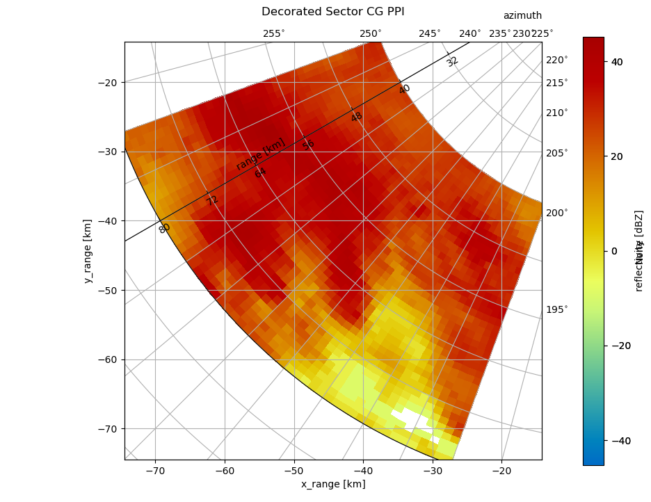
Sector CG PPI#
What if I want to plot only an interesting sector of the whole PPI? Not as easy, one might think. Note, that we can use infer_intervals = True here to get nice grid cell alignment. We also can generate a so called floating axis using the cgax now. Here we go:
[7]:
cg = {"angular_spacing": 20.0}
fig = plt.figure(figsize=(10, 8))
sel = da.sel(azimuth=slice(200, 250), range=slice(40, 80))
pm = sel.wrl.vis.plot(
    fig=fig,
    crs=cg,
    infer_intervals=True,
)
cgax = plt.gca()
caax = cgax.parasites[0]
paax = cgax.parasites[1]

t = plt.title("Decorated Sector CG PPI", y=1.05)
cbar = plt.gcf().colorbar(pm, pad=0.075, ax=cgax)
caax.set_xlabel("x_range [km]")
caax.set_ylabel("y_range [km]")
plt.text(1.0, 1.05, "azimuth", transform=caax.transAxes, va="bottom", ha="right")
cbar.set_label("reflectivity [dBZ]")

# add floating axis
cgax.axis["lat"] = cgax.new_floating_axis(0, 240)
cgax.axis["lat"].set_ticklabel_direction("-")
cgax.axis["lat"].label.set_text("range [km]")
cgax.axis["lat"].label.set_rotation(180)
cgax.axis["lat"].label.set_pad(10)
Special Markers#
One more good thing about curvelinear axes is that you can plot polar as well as cartesian data. However, you have to be careful, where to plot. Polar data has to be plottet to the parasite axis (paax). Cartesian data can be plottet to caax, although you can also plot cartesian data to the main cgax.
Anyway, it is easy to overlay your polar data, with other station data (e.g. gauges). Taking the former sector example, we can plot some additional stations:
[8]:
fig = plt.figure(figsize=(10, 8))
cg = {"angular_spacing": 20.0}
sel = da.sel(azimuth=slice(200, 250), range=slice(40, 80))
pm = sel.wrl.vis.plot(
    fig=fig,
    crs=cg,
    infer_intervals=True,
)
cgax = plt.gca()
caax = cgax.parasites[0]
paax = cgax.parasites[1]
t = plt.title("Decorated Sector CG PPI", y=1.05)
cbar = plt.gcf().colorbar(pm, pad=0.075, ax=cgax)
caax.set_xlabel("x_range [km]")
caax.set_ylabel("y_range [km]")
plt.text(1.0, 1.05, "azimuth", transform=caax.transAxes, va="bottom", ha="right")
cbar.set_label("reflectivity [dBZ]")
cgax.axis["lat"] = cgax.new_floating_axis(0, 240)
cgax.axis["lat"].set_ticklabel_direction("-")
cgax.axis["lat"].label.set_text("range [km]")
cgax.axis["lat"].label.set_rotation(180)
cgax.axis["lat"].label.set_pad(10)
# plot on cartesian axis
caax.plot(-60, -60, "ro", label="caax")
caax.plot(-50, -70, "ro")
# plot on polar axis
paax.plot(220, 88, "bo", label="paax")
# plot on cg axis (same as on cartesian axis)
cgax.plot(-60, -70, "go", label="cgax")
# legend on main cg axis
cgax.legend()
[8]:
<matplotlib.legend.Legend at 0x7f4a3407da10>

Special Specials#
But there is more to know, when using the curvelinear grids! As an example, you can get access to the underlying cgax and grid_helper to change azimuth and range resolution as well as tick labels:
[9]:
from mpl_toolkits.axisartist.grid_finder import FixedLocator, DictFormatter

# cg = {'lon_cycle': 360.}
cg = {"angular_spacing": 20.0}
fig = plt.figure(figsize=(10, 8))
sel = da.sel(azimuth=slice(200, 250), range=slice(40, 80))
pm = sel.wrl.vis.plot(
    fig=fig,
    crs=cg,
    infer_intervals=True,
)
cgax = plt.gca()
caax = cgax.parasites[0]
paax = cgax.parasites[1]

t = plt.title("Decorated Sector CG PPI", y=1.05)
t.set_y(1.05)
cbar = plt.gcf().colorbar(pm, pad=0.075, ax=cgax)
caax.set_xlabel("x_range [km]")
caax.set_ylabel("y_range [km]")
plt.text(1.0, 1.05, "azimuth", transform=caax.transAxes, va="bottom", ha="right")
cbar.set_label("reflectivity [dBZ]")
gh = cgax.get_grid_helper()
# set azimuth resolution to 15deg
locs = [i for i in np.arange(0.0, 360.0, 5.0)]
gh.grid_finder.grid_locator1 = FixedLocator(locs)
gh.grid_finder.tick_formatter1 = DictFormatter(
    dict([(i, r"${0:.0f}^\circ$".format(i)) for i in locs])
)
gh.grid_finder.grid_locator2._nbins = 20
gh.grid_finder.grid_locator2._steps = [1, 1.5, 2, 2.5, 5, 10]
cgax.axis["lat"] = cgax.new_floating_axis(0, 240)
cgax.axis["lat"].set_ticklabel_direction("-")
cgax.axis["lat"].label.set_text("range [km]")
cgax.axis["lat"].label.set_rotation(180)
cgax.axis["lat"].label.set_pad(10)

The use of FixedLocator and DictFormatter should be clear. The use of _nbins and _steps is a bit of head-twisting. With _steps you can set the possible divisions of the range. In connection with the _nbins the range grid is created depending on maximum range. In the above situation with _nbins set to 10 we get an range grid resolution of 25 (divider 2.5). When setting steps to 20 we get a resolution of 15 (divider 1.5). Choosing 30 lead to resolution of 10 (divider
1/10). So it may be good to play around a bit, for wanted results.
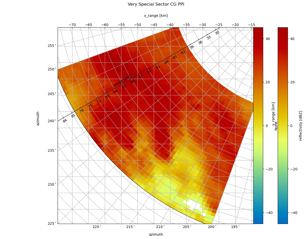
As you might have noticed the cartesian grid remained the same and the azimuth labels are bit overplottet. But matplotlib would be not matplotlib if there would be no solution. First we take care of the labeling. We push the title a bit higher to get space and toggle the caax labels to right and top:
t = plt.title('Very Special Sector CG PPI', y=1.1)
caax.toggle_axisline()
Then we toggle “left” and “right” and “top” and “bottom” axis behaviour. We also have to put the colorbar a bit to the side and alter the location of the azimuth label. And, not to forgot to adapt the ticklabels of the cartesian axes. With little effort we got a better (IMHO) representation.
[10]:
# constrained_layout/tight_layout is currently broken in matplotlib for the AxesGrid1, going without it for the moment

fig = plt.figure(figsize=(12, 10))  # , constrained_layout=True)
cg = {"angular_spacing": 20.0}
sel = da.sel(azimuth=slice(200, 250), range=slice(40, 80))
pm = sel.wrl.vis.plot(
    fig=fig,
    crs=cg,
    infer_intervals=True,
)
cgax = plt.gca()
caax = cgax.parasites[0]
paax = cgax.parasites[1]

t = plt.title("Very Special Sector CG PPI", y=1.1)
cbar = plt.gcf().colorbar(pm, pad=0.1, ax=cgax, fraction=0.046)
plt.text(0.5, 1.05, "x_range [km]", transform=caax.transAxes, va="bottom", ha="center")
plt.text(
    1.1,
    0.5,
    "y_range [km]",
    transform=caax.transAxes,
    va="bottom",
    ha="center",
    rotation="vertical",
)
caax.set_xlabel("x_range [km]")
caax.set_ylabel("y_range [km]")
caax.toggle_axisline()


# make ticklabels of right and top axis visible
caax.axis["top", "right"].set_visible(True)
caax.axis["top", "right"].major_ticklabels.set_visible(True)
caax.grid(True)

from matplotlib.ticker import MaxNLocator

caax.xaxis.set_major_locator(MaxNLocator(15))
caax.yaxis.set_major_locator(MaxNLocator(15))

# make ticklabels of left and bottom axis visible,
cgax.axis["left"].major_ticklabels.set_visible(True)
cgax.axis["bottom"].major_ticklabels.set_visible(True)
cgax.axis["left"].get_helper().nth_coord_ticks = 0
cgax.axis["bottom"].get_helper().nth_coord_ticks = 0
# and also set tickmarklength to zero for better presentation
cgax.axis["right"].major_ticks.set_ticksize(0)
cgax.axis["top"].major_ticks.set_ticksize(0)
# make ticklabels of right and top axis unvisible,
cgax.axis["right"].major_ticklabels.set_visible(False)
cgax.axis["top"].major_ticklabels.set_visible(False)
# and also set tickmarklength to zero for better presentation
cgax.axis["right"].major_ticks.set_ticksize(0)
cgax.axis["top"].major_ticks.set_ticksize(0)
plt.text(0.5, -0.065, "azimuth", transform=caax.transAxes, va="bottom", ha="center")
plt.text(
    -0.1,
    0.5,
    "azimuth",
    transform=caax.transAxes,
    va="bottom",
    ha="center",
    rotation="vertical",
)
cbar.set_label("reflectivity [dBZ]")

gh = cgax.get_grid_helper()
# set azimuth resolution to 5deg
locs = [i for i in np.arange(0.0, 360.0, 5.0)]
gh.grid_finder.grid_locator1 = FixedLocator(locs)
gh.grid_finder.tick_formatter1 = DictFormatter(
    dict([(i, r"${0:.0f}^\circ$".format(i)) for i in locs])
)
gh.grid_finder.grid_locator2._nbins = 30
gh.grid_finder.grid_locator2._steps = [1, 1.5, 2, 2.5, 5, 10]
cgax.axis["lat"] = cgax.new_floating_axis(0, 240)
cgax.axis["lat"].set_ticklabel_direction("-")
cgax.axis["lat"].label.set_text("range [km]")
cgax.axis["lat"].label.set_rotation(180)
cgax.axis["lat"].label.set_pad(10)
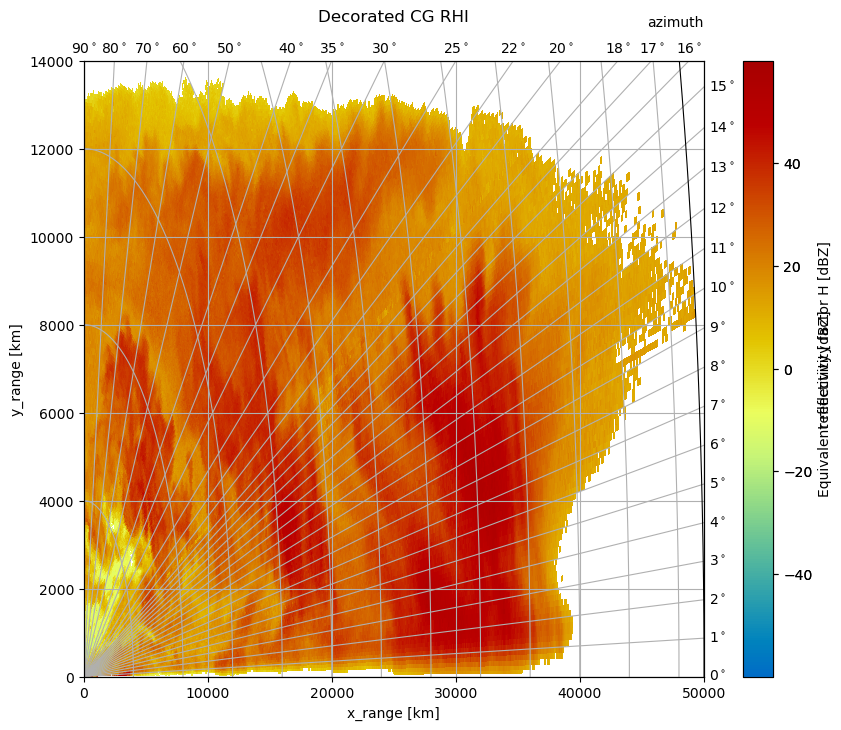
Plot CG RHI#
wradlib.vis.plot() is used in this section. An CG RHI plot is a little different compared to an CG PPI plot. I covers only one quadrant and the data is plottet counterclockwise from “east” (3 o’clock) to “north” (12 o’clock).
Everything else is much the same and you can do whatever you want as shown in the section Plot CG PPI.
So just a quick example of an cg rhi plot with some decorations. Note, the grid_locator1 for the theta angles is overwritten and now the grid is much finer.
[11]:
from mpl_toolkits.axisartist.grid_finder import FixedLocator, DictFormatter

# reading in GAMIC hdf5 file
filename = wrl.util.get_wradlib_data_file("hdf5/2014-06-09--185000.rhi.mvol")
swp = xr.open_dataset(filename, engine="gamic", group="sweep_0")
[12]:
da = swp.wrl.georef.georeference().DBZH.assign_coords(sweep_mode=swp.sweep_mode)
da
[12]:
<xarray.DataArray 'DBZH' (elevation: 459, range: 667)>
[306153 values with dtype=float32]
Coordinates: (12/15)
    azimuth     (elevation) float64 225.0 225.0 405.0 ... 225.0 225.0 225.0
    time        (elevation) datetime64[ns] ...
  * range       (range) float32 37.5 112.5 187.5 ... 4.991e+04 4.999e+04
    longitude   float64 7.072
    latitude    float64 50.73
    altitude    float64 99.5
    ...          ...
    z           (elevation, range) float64 99.63 99.76 ... 5.001e+04 5.009e+04
    gr          (elevation, range) float64 18.52 93.52 168.5 ... 66.65 66.78
    rays        (elevation, range) float64 0.09888 0.09888 0.09888 ... 89.9 89.9
    bins        (elevation, range) float32 37.5 112.5 ... 4.991e+04 4.999e+04
    crs_wkt     int64 0
    sweep_mode  <U3 'rhi'
Attributes:
    format:         UV16
    units:          dBZ
    long_name:      Equivalent reflectivity factor H
    standard_name:  radar_equivalent_reflectivity_factor_h
_Undetect: 0.0[13]:
fig = plt.figure(figsize=(10, 8))
pm = da.wrl.vis.plot(fig=fig, ax=111, crs="cg")
cgax = plt.gca()
caax = cgax.parasites[0]
paax = cgax.parasites[1]

t = plt.title("Decorated CG RHI", y=1.05)

cgax.set_xlim(0, 50000)
cgax.set_ylim(0, 14000)
cbar = plt.gcf().colorbar(pm, pad=0.05, ax=cgax)
cbar.set_label("reflectivity [dBZ]")
caax.set_xlabel("x_range [km]")
caax.set_ylabel("y_range [km]")
plt.text(1.0, 1.05, "azimuth", transform=caax.transAxes, va="bottom", ha="right")
gh = cgax.get_grid_helper()

# set theta to some nice values
locs = [
    0.0,
    1.0,
    2.0,
    3.0,
    4.0,
    5.0,
    6.0,
    7.0,
    8.0,
    9.0,
    10.0,
    11.0,
    12.0,
    13.0,
    14.0,
    15.0,
    16.0,
    17.0,
    18.0,
    20.0,
    22.0,
    25.0,
    30.0,
    35.0,
    40.0,
    50.0,
    60.0,
    70.0,
    80.0,
    90.0,
]
gh.grid_finder.grid_locator1 = FixedLocator(locs)
gh.grid_finder.tick_formatter1 = DictFormatter(
    dict([(i, r"${0:.0f}^\circ$".format(i)) for i in locs])
)
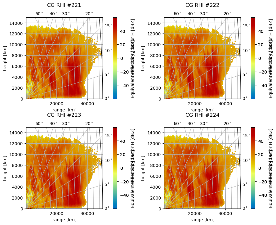
Plotting on Grids#
There are serveral possibilities to plot multiple cg plots in one figure. Since both plotting routines are equipped with the same mechanisms it is concentrated mostly on RHI plots.
Note
Using the :func:tight_layout and :func:subplots_adjust functions most alignment problems can be avoided.
The Built-In Method#
Using the matplotlib grid definition for the parameter subplot, we can easily plot two or more plots in one figure on a regular grid:
[14]:
subplots = [221, 222, 223, 224]
fig = plt.figure(figsize=(10, 8))
fig.subplots_adjust(wspace=0.35, hspace=0.35)
for sp in subplots:
    pm = da.wrl.vis.plot(ax=sp, crs="cg")
    cgax = plt.gca()
    caax = cgax.parasites[0]
    paax = cgax.parasites[1]
    t = plt.title("CG RHI #%(sp)d" % locals(), y=1.1)
    cgax.set_ylim(0, 15000)
    cbar = plt.gcf().colorbar(pm, pad=0.1, ax=cgax)
    caax.set_xlabel("range [km]")
    caax.set_ylabel("height [km]")
    gh = cgax.get_grid_helper()
    # set theta to some nice values
    locs = [0.0, 5.0, 10.0, 15.0, 20.0, 30.0, 40.0, 60.0, 90.0]
    gh.grid_finder.grid_locator1 = FixedLocator(locs)
    gh.grid_finder.tick_formatter1 = DictFormatter(
        dict([(i, r"${0:.0f}^\circ$".format(i)) for i in locs])
    )
    cbar.set_label("reflectivity [dBZ]")
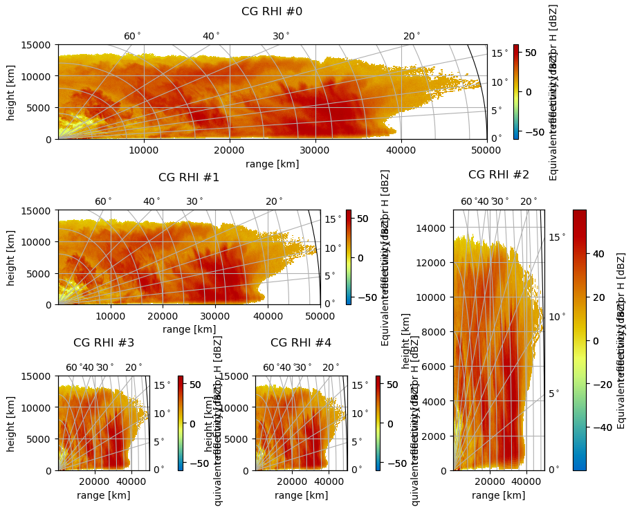
The GridSpec Method#
Here the abilities of Matplotlib GridSpec are used. Now we can also plot on irregular grids. Just create your grid and take the GridSpec object as an input to the parameter ax as follows (some padding has to be adjusted to get a nice plot):
[15]:
import matplotlib.gridspec as gridspec

gs = gridspec.GridSpec(3, 3, hspace=0.75, wspace=0.4)
subplots = [gs[0, :], gs[1, :-1], gs[1:, -1], gs[-1, 0], gs[-1, -2]]
cbarpad = [0.05, 0.075, 0.2, 0.2, 0.2]
labelpad = [1.25, 1.25, 1.1, 1.25, 1.25]
fig = plt.figure(figsize=(10, 8))
for i, sp in enumerate(subplots):
    pm = da.wrl.vis.plot(ax=sp, crs="cg")
    cgax = plt.gca()
    caax = cgax.parasites[0]
    paax = cgax.parasites[1]
    t = plt.title("CG RHI #%(i)d" % locals(), y=labelpad[i])
    cgax.set_ylim(0, 15000)
    cbar = fig.colorbar(pm, pad=cbarpad[i], ax=cgax)
    caax.set_xlabel("range [km]")
    caax.set_ylabel("height [km]")
    gh = cgax.get_grid_helper()
    # set theta to some nice values
    locs = [0.0, 5.0, 10.0, 15.0, 20.0, 30.0, 40.0, 60.0, 90.0]
    gh.grid_finder.grid_locator1 = FixedLocator(locs)
    gh.grid_finder.tick_formatter1 = DictFormatter(
        dict([(i, r"${0:.0f}^\circ$".format(i)) for i in locs])
    )
    cbar.set_label("reflectivity [dBZ]")
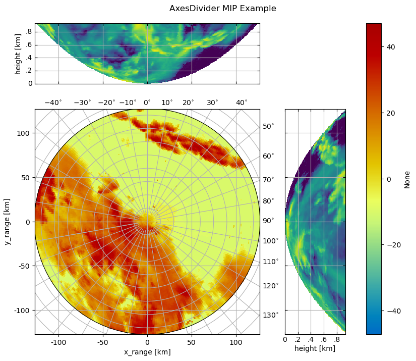
The AxesDivider Method#
Here the capabilities of Matplotlib AxesGrid1 are used.
We make a PPI now, it matches much better. Just plot your PPI data and create an axes divider:
from mpl_toolkits.axes_grid1 import make_axes_locatable
from matplotlib.ticker import NullFormatter, FuncFormatter, MaxNLocator
divider = make_axes_locatable(cgax)
Now you can easily append more axes to plot some other things, eg a maximum intensity projection:
axMipX = divider.append_axes("top", size=1.2, pad=0.1, sharex=cgax)
axMipY = divider.append_axes("right", size=1.2, pad=0.1, sharey=cgax)
[16]:
# angle of *cut* through ppi and scan elev.
angle = 0.0
elev = 0.0

filename = wrl.util.get_wradlib_data_file("misc/polar_dBZ_tur.gz")
data2 = np.loadtxt(filename)
# we need to have meter here for the georef function inside mip
d1 = np.arange(data2.shape[1], dtype=float) * 1000
d2 = np.arange(data2.shape[0], dtype=float)
data2 = np.roll(data2, (d2 >= angle).nonzero()[0][0], axis=0)

da = (
    wrl.georef.create_xarray_dataarray(
        data2,
        r=d1,
        phi=d2,
    )
    .wrl.georef.georeference()
    .assign_coords(sweep_mode="azimuth_surveillance")
)

# calculate max intensity proj
xs, ys, mip1 = wrl.georef.maximum_intensity_projection(
    data2, r=d1, az=d2, angle=angle, elev=elev
)
xs, ys, mip2 = wrl.georef.maximum_intensity_projection(
    data2, r=d1, az=d2, angle=90 + angle, elev=elev
)
OK, we have to create the mip data, we use the wradlib.georef.polar.maximum_intensity_projection():
We also need a new formatter:
[17]:
def mip_formatter(x, pos):
    x = x / 1000.0
    fmt_str = "{:g}".format(x)
    if np.abs(x) > 0 and np.abs(x) < 1:
        return fmt_str.replace("0", "", 1)
    else:
        return fmt_str
[18]:
from mpl_toolkits.axes_grid1 import make_axes_locatable
from matplotlib.ticker import NullFormatter, FuncFormatter, MaxNLocator

fig = plt.figure(figsize=(10, 8))
# normal cg plot
cg = {"latmin": 10000.0, "radial_spacing": 12}
pm = da.wrl.vis.plot(fig=fig, crs=cg)
cgax = plt.gca()
caax = cgax.parasites[0]
paax = cgax.parasites[1]
cgax.set_aspect(1.0)

cgax.grid(True)

cgax.set_xlim(-np.max(d1), np.max(d1))
cgax.set_ylim(-np.max(d1), np.max(d1))
caax.xaxis.set_major_formatter(FuncFormatter(mip_formatter))
caax.yaxis.set_major_formatter(FuncFormatter(mip_formatter))
caax.set_xlabel("x_range [km]")
caax.set_ylabel("y_range [km]")

# axes divider section
divider = make_axes_locatable(cgax)
axMipX = divider.append_axes("top", size=1.2, pad=0.5, sharex=cgax)
axMipY = divider.append_axes("right", size=1.2, pad=0.5, sharey=cgax)

# special handling for labels etc.
# cgax.axis["right"].major_ticklabels.set_visible(False)
# cgax.axis["top"].major_ticklabels.set_visible(False)
axMipX.xaxis.set_major_formatter(NullFormatter())
axMipX.yaxis.set_major_formatter(FuncFormatter(mip_formatter))
axMipX.yaxis.set_major_locator(MaxNLocator(5))
axMipY.yaxis.set_major_formatter(NullFormatter())
axMipY.xaxis.set_major_formatter(FuncFormatter(mip_formatter))
axMipY.xaxis.set_major_locator(MaxNLocator(5))

# plot max intensity proj
ma = np.ma.array(mip1, mask=np.isnan(mip1))
axMipX.pcolormesh(xs, ys, ma)
ma = np.ma.array(mip2, mask=np.isnan(mip2))
axMipY.pcolormesh(ys.T, xs.T, ma.T)

# set labels, limits etc
er = 6370000.0
axMipX.set_xlim(-np.max(d1), np.max(d1))
axMipX.set_ylim(0, wrl.georef.bin_altitude(d1[-2], elev, 0, re=er))
axMipY.set_xlim(0, wrl.georef.bin_altitude(d1[-2], elev, 0, re=er))
axMipY.set_ylim(-np.max(d1), np.max(d1))
axMipX.set_ylabel("height [km]")
axMipY.set_xlabel("height [km]")
axMipX.grid(True)
axMipY.grid(True)
t = plt.gcf().suptitle("AxesDivider MIP Example")
t.set_y(0.925)