Quick-view a sweep in polar or cartesian reference systems#
[1]:
import numpy as np
import matplotlib.pyplot as plt
import wradlib as wrl
import warnings
import cmweather

warnings.filterwarnings("ignore")
try:
    get_ipython().run_line_magic("matplotlib inline")
except:
    plt.ion()
Read a polar data set from the German Weather Service#
[2]:
filename = wrl.util.get_wradlib_data_file("dx/raa00-dx_10908-0806021735-fbg---bin.gz")
print(filename)
/home/runner/work/wradlib/wradlib/wradlib-data/dx/raa00-dx_10908-0806021735-fbg---bin.gz
[3]:
img, meta = wrl.io.read_dx(filename)
Inspect the data set a little
[4]:
print("Shape of polar array: %r\n" % (img.shape,))
print("Some meta data of the DX file:")
print("\tdatetime: %r" % (meta["datetime"],))
print("\tRadar ID: %s" % (meta["radarid"],))
Shape of polar array: (360, 128)

Some meta data of the DX file:
        datetime: datetime.datetime(2008, 6, 2, 17, 35, tzinfo=<UTC>)
        Radar ID: 10908
The simplest plot#
[5]:
r = np.arange(img.shape[1], dtype=float)
r += (r[1] - r[0]) / 2.0
r *= 1000
az = np.arange(img.shape[0], dtype=float)
az += (az[1] - az[0]) / 2.0
img = wrl.georef.create_xarray_dataarray(img, r=r, phi=az, site=(10, 45, 0))
img
[5]:
<xarray.DataArray (azimuth: 360, range: 128)>
array([[  0. , -24. , -21. , ...,  28.5,  29. ,  35. ],
       [-13.5, -22. , -17. , ...,  15. ,   7. ,   3.5],
       [-32.5, -32.5, -32.5, ...,   6. ,   8.5,   9.5],
       ...,
       [  0.5, -17.5, -23. , ...,  33. ,  32.5,  29. ],
       [-11. , -21. , -20. , ...,  36. ,  34.5,  32.5],
       [-15. , -24. , -20.5, ...,  39. ,  37. ,  38. ]])
Coordinates:
  * range       (range) float64 500.0 1.5e+03 2.5e+03 ... 1.265e+05 1.275e+05
  * azimuth     (azimuth) float64 0.5 1.5 2.5 3.5 ... 356.5 357.5 358.5 359.5
    elevation   (azimuth) float64 0.0 0.0 0.0 0.0 0.0 ... 0.0 0.0 0.0 0.0 0.0
    longitude   int64 10
    latitude    int64 45
    altitude    int64 0
sweep_mode <U20 'azimuth_surveillance'[6]:
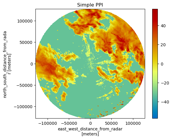
img = img.wrl.georef.georeference()
pm = img.wrl.vis.plot()
txt = plt.title("Simple PPI")
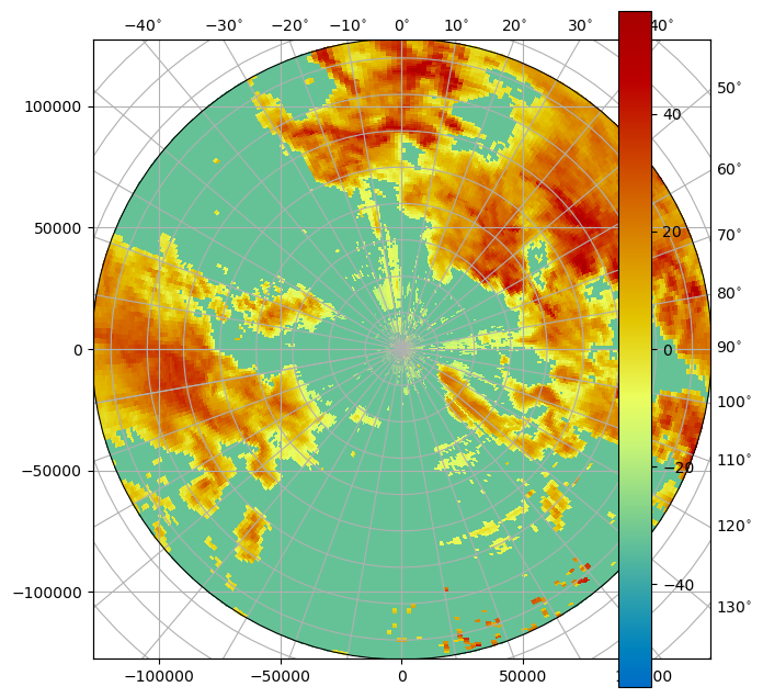
Plot in curvelinear grid#
[7]:
fig = plt.figure(figsize=(16, 8))
pm = img.wrl.vis.plot(crs="cg", ax=121, fig=fig)
Plot in projected coordinate system#
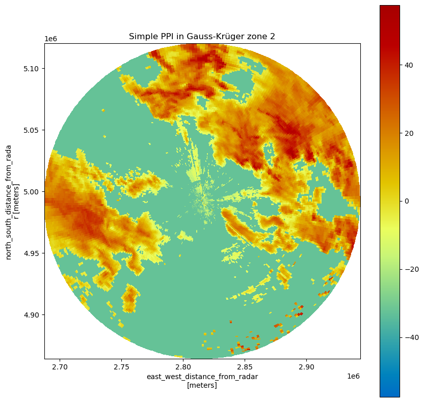
[8]:
epsg = wrl.georef.epsg_to_osr(31466)
img = img.wrl.georef.georeference(crs=epsg)

fig = plt.figure(figsize=(10, 10))
pm = img.wrl.vis.plot(ax=111, fig=fig)
txt = plt.title("Simple PPI in Gauss-Krüger zone 2")
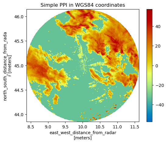
Plot in WGS 84 coordinates#
[9]:
proj = wrl.georef.get_default_projection()
img = img.wrl.georef.georeference(crs=proj)

pm = img.wrl.vis.plot()
txt = plt.title("Simple PPI in WGS84 coordinates")
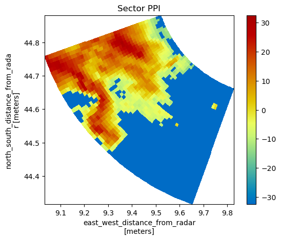
Plotting just one sector#
For this purpose, we need to give the ranges and azimuths explicitly…
[10]:
pm = img[200:251, 40:81].wrl.vis.plot()
txt = plt.title("Sector PPI")
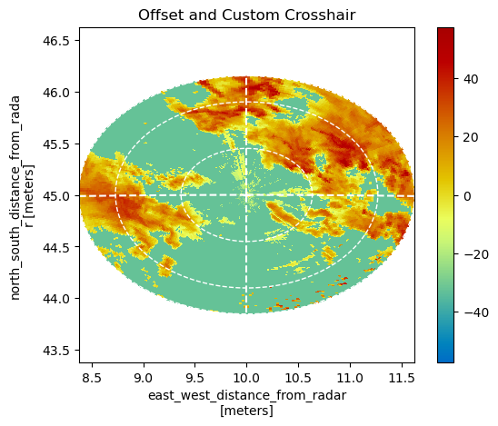
Adding a crosshair to the PPI#
[11]:
# plot the PPI
pm = img.wrl.vis.plot()
# ... plot a crosshair over our data...
ax = plt.gca()
# ... plot a crosshair over our data...
wrl.vis.plot_ppi_crosshair(
    site=(img.longitude.values, img.latitude.values, img.altitude.values),
    ranges=[50e3, 100e3, 128e3],
    angles=[0, 90, 180, 270],
    line=dict(color="white"),
    circle={"edgecolor": "white"},
    ax=ax,
    crs=proj,
)
plt.title("Offset and Custom Crosshair")
plt.axis("tight")
plt.gca().set_aspect("equal")
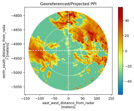
Placing the polar data in a projected Cartesian reference system#
Using the proj keyword we tell the function to: - interpret the site coordinates as longitude/latitude - reproject the coordinates to the given projection (here: dwd-radolan composite coordinate system)
[12]:
proj_rad = wrl.georef.create_osr("dwd-radolan")
img = img.wrl.georef.georeference(crs=proj_rad)
img.wrl.vis.plot()
ax = plt.gca()
# Now the crosshair ranges must be given in meters
wrl.vis.plot_ppi_crosshair(
    site=(img.longitude.values, img.latitude.values, img.altitude.values),
    ranges=[40000, 80000, 128000],
    line=dict(color="white"),
    circle={"edgecolor": "white"},
    ax=ax,
    crs=proj_rad,
)
plt.title("Georeferenced/Projected PPI")
plt.axis("tight")
plt.gca().set_aspect("equal")
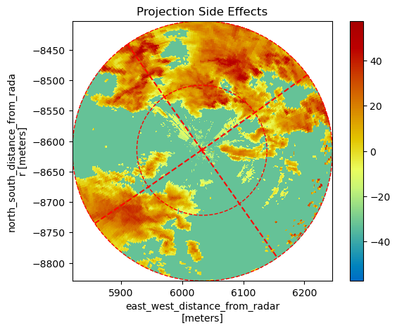
Some side effects of georeferencing#
Transplanting the radar virtually moves it away from the central meridian of the projection (which is 10 degrees east). Due north now does not point straight upwards on the map.
The crosshair shows this: for the case that the lines should actually become curved, they are implemented as a piecewise linear curve with 10 vertices. The same is true for the range circles, but with more vertices, of course.
[13]:
site = (45.0, 7.0, 0.0)
img["longitude"].values, img["latitude"].values = (45.0, 7.0)
img = img.wrl.georef.georeference(crs=proj_rad)
img.wrl.vis.plot()
ax = plt.gca()
ax = wrl.vis.plot_ppi_crosshair(
    site=(img.longitude.values, img.latitude.values, img.altitude.values),
    ranges=[64000, 128000],
    line=dict(color="red"),
    circle={"edgecolor": "red"},
    crs=proj_rad,
    ax=ax,
)
txt = plt.title("Projection Side Effects")
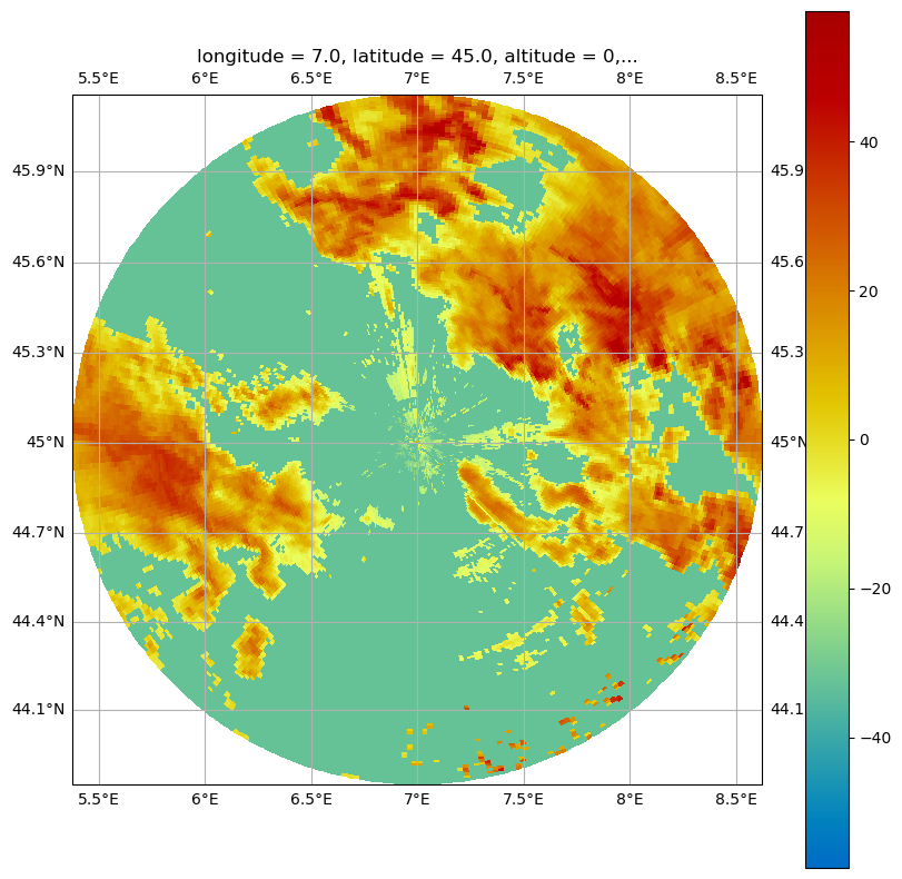
Plot on Mercator-Map using cartopy#
[14]:
import cartopy.crs as ccrs

map_proj = ccrs.Mercator(central_longitude=site[1])
[15]:
img["longitude"].values, img["latitude"].values = (7.0, 45.0)
img = img.wrl.georef.georeference()
fig = plt.figure(figsize=(10, 10))
img.wrl.vis.plot(crs=map_proj, fig=fig, ax=111)
ax = plt.gca()
ax.gridlines(draw_labels=True)
[15]:
<cartopy.mpl.gridliner.Gridliner at 0x7f727ee53d90>
More decorations and annotations#
You can annotate these plots by using standard matplotlib methods.
[16]:
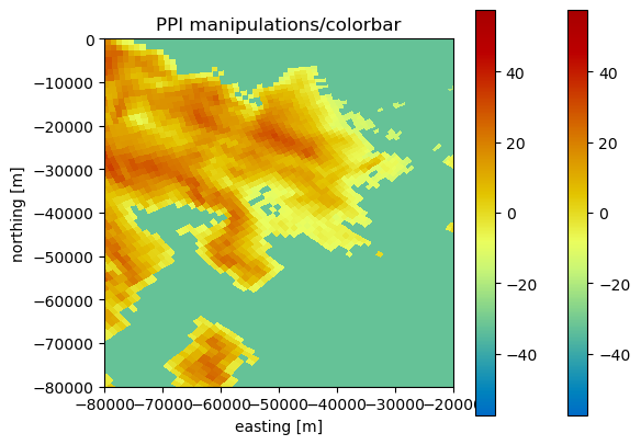
pm = img.wrl.vis.plot()
ax = plt.gca()
ylabel = ax.set_xlabel("easting [m]")
ylabel = ax.set_ylabel("northing [m]")
title = ax.set_title("PPI manipulations/colorbar")
# you can now also zoom - either programmatically or interactively
xlim = ax.set_xlim(-80000, -20000)
ylim = ax.set_ylim(-80000, 0)
# as the function returns the axes- and 'mappable'-objects colorbar needs, adding a colorbar is easy
cb = plt.colorbar(pm, ax=ax)